How to Analyze Email Marketing Data with AI (Mailchimp, Klaviyo, Any ESP)
I loaded 455 email campaigns and 5,000 subscribers into a local analytics MCP server and asked it plain-English questions: best send time, subject line length vs open rate, why people unsubscribe, and which campaigns actually earn revenue. Every number comes from a recorded statistical test.
Quick answer
Export campaigns and subscribers from your ESP (Mailchimp, Klaviyo or any platform) to CSV, connect an AI assistant to a local analytics engine like meelu-analytics-mcp, and ask plain-English questions. Across 455 demo campaigns: Tuesday-morning and Thursday-midday sends opened best (~29–30%), subject lines of 26–39 characters peaked at 27.4% opens, unsubscribes jumped after four full-list sends in a week, and abandoned-cart emails earned $0.82 per recipient versus about a penny for newsletters.
Every email marketer has the same folder of exports: a campaigns CSV from Klaviyo or Mailchimp, a subscribers CSV, and a list of questions nobody has time to answer properly. When is the best time to send marketing emails, according to data rather than a blog post from 2019? Does subject line length change open rate? Why are people unsubscribing? Which campaign types earn their keep?
I ran that exercise end to end. I generated a demo dataset for a fictional DTC coffee brand — 455 campaigns over 18 months and 5,000 subscribers, with realistic patterns and noise baked in — loaded it into the meelu-analytics MCP server (a local tool that lets Claude run real calculations on your CSVs), and asked my questions in plain English. To be clear: this is synthetic data, so the specific percentages below describe the demo brand, not your list. The method, though, works on any campaign export, and that's the point of this post.
One thing to know up front: every result this server returns carries a trust block — a confidence level (high, moderate, low) plus caveats — and it will decline to answer rather than make a number up. I'll report those honestly throughout, including the two places where the first answer was misleading and the one "significant" result that turned out to be an artifact.
What is the best time to send marketing emails, according to the data?
I asked whether open rate (opens divided by recipients) differs by day of the week. The server ran a formal check of the question and came back clear: the day-of-week difference is real beyond any reasonable doubt, though day of week explains only a modest share of the overall variation. Trust: high.
The day-of-week averages, straight from a query on the same session:
| Day | Avg open rate |
|---|---|
| Tuesday | 28.3% |
| Wednesday | 28.3% |
| Thursday | 27.8% |
| Friday | 25.8% |
| Monday | 25.0% |
| Saturday | 21.7% |
| Sunday | 19.4% |
Then an honest wrinkle. When I tested the raw send hour (12 distinct hours) against open rate, the answer came back no clear difference — with a caveat that some hourly groups were too small. Twelve thin slices hid the pattern. Binned into three dayparts (morning 7–11am, midday/afternoon 12–4pm, evening 6–9pm), a real difference emerged, though a small one. The tool reported both results as they were; it didn't smooth the first one over.
The full day-by-daypart grid makes the pattern visible:
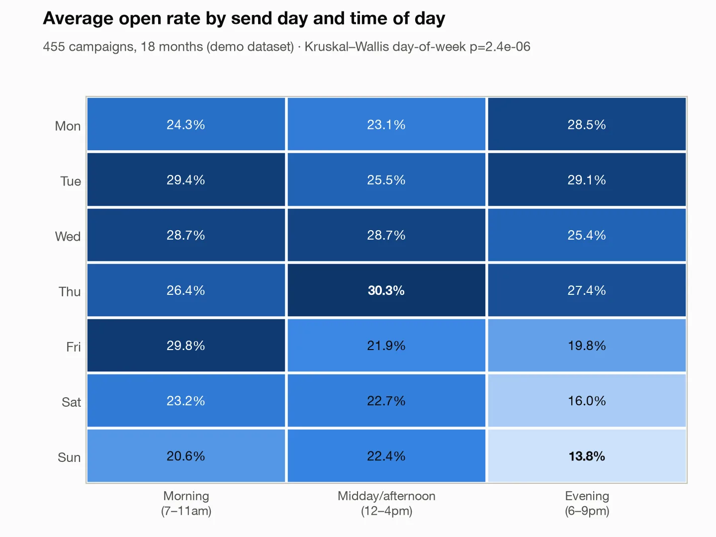
Best cells: Thursday midday (30.3%), Tuesday morning (29.4%), Friday morning (29.8%). Worst by far: weekend evenings — Saturday evening at 16.0% and Sunday evening at 13.8%, roughly half the best slot. The standing caveat on every association result applies here: association is not causation. Campaign mix differs by day, so treat the grid as "where our sends performed," not a law of physics — and A/B test before you rearrange your calendar.
Does email subject line length affect open rate?
This one is a small lesson in how questions get answered. Asked directly — subject length (a number) versus open rate (a number) — the server checked whether open rate tends to fall as subjects get longer. Result: a weak link, barely detectable, with the explicit caveat that a weak link "explains only part of the variation."
That near-miss happens because a straight trend check only sees relationships that run steadily up or steadily down. If the true shape is an inverted U (short and long both underperform, the middle wins), that kind of check mostly averages it away. So I binned subject length into six equal-width ranges and re-tested. Now the difference across bins was clear — real beyond any reasonable doubt.
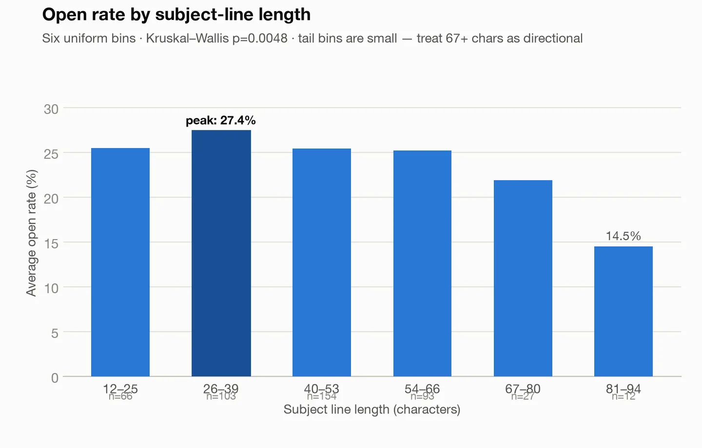
| Subject length | Campaigns | Avg open rate |
|---|---|---|
| 12–25 chars | 66 | 25.5% |
| 26–39 chars | 103 | 27.4% |
| 40–53 chars | 154 | 25.4% |
| 54–66 chars | 93 | 25.2% |
| 67–80 chars | 27 | 21.9% |
| 81–94 chars | 12 | 14.5% |
The sweet spot for this program sits around 26–39 characters, with a cliff past 67. Honesty note: the two long-tail bins hold only 27 and 12 campaigns, and the test itself flagged the small groups — treat "80+ characters is a disaster" as directional until you have more long-subject sends to measure.
Why are people unsubscribing?
The unsubscribe question is usually asked in a panic and answered with a guess. Here it took one derived table: for each of 77 weeks, count the full-list campaigns sent and compute that week's unsubscribe rate (unsubscribes divided by recipients).
| Full-list sends in a week | Weeks | Avg unsubscribe rate |
|---|---|---|
| 1 | 14 | 0.167% |
| 2 | 19 | 0.163% |
| 3 | 21 | 0.154% |
| 4 | 10 | 0.248% |
| 5 | 10 | 0.425% |
| 6 | 3 | 0.436% |
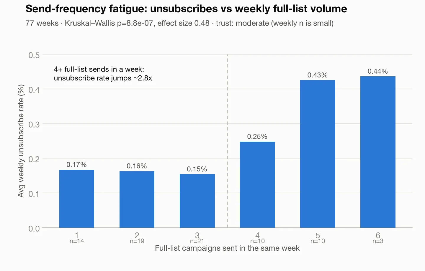
One to three full-list sends per week: unsubscribes hold flat around 0.15–0.17%. At four sends the rate jumps, and at five it hits 0.425% — about 2.8x the three-send baseline. The analysis scored this link as real beyond any reasonable doubt, and strong — the strongest relationship in the campaign data after campaign type itself.
Note the trust level, though: moderate, not high, because 77 weekly rows is a modest sample and only 13 weeks had five-plus sends. The server said exactly that instead of rounding up to certainty. The practical read: this list tolerates three full-list sends a week; the fourth is where fatigue starts charging interest.
Which campaigns actually make money per send?
Open rate is a vanity contest without revenue attached, so I computed revenue per recipient — total campaign revenue divided by recipients — and compared campaign types. This was the most decisive result in the whole session: the strongest link in the entire dataset, real beyond any reasonable doubt, trust: high.
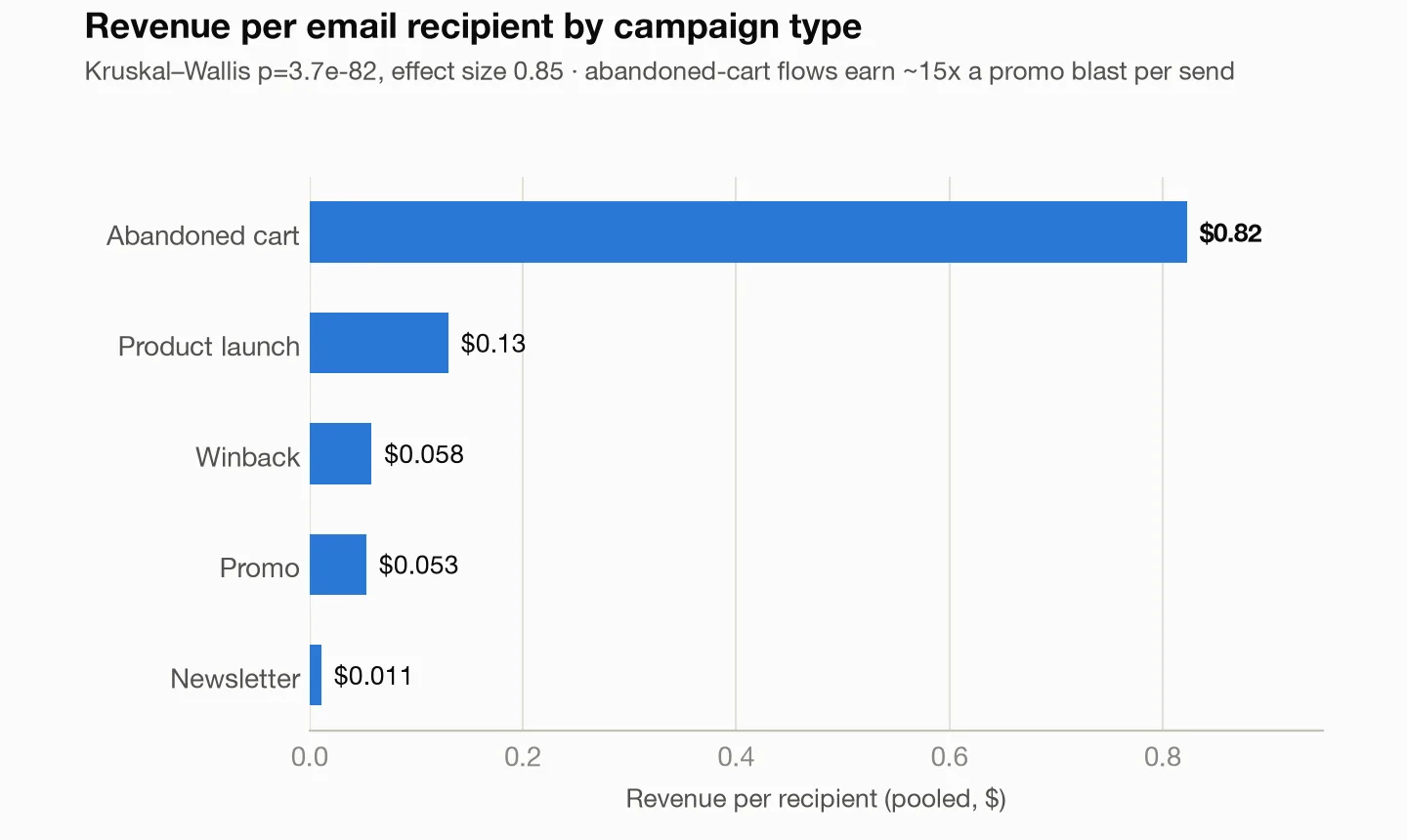
Abandoned-cart emails earned $0.82 per recipient — roughly 15x a promo blast ($0.053) and 75x a newsletter ($0.011) — while making up about 1% of total send volume yet 19.6% of all email revenue ($86,074 of $440,203).
The winback result surprised me, and I'd have gotten it wrong from intuition. Winbacks earned only $0.058 per recipient, promo-level, even though their revenue per click was $6.92 versus a promo's $2.15. The explanation is upstream: winbacks go to lapsed subscribers who open at 6.2%, so almost nobody reaches the high-converting click. The campaigns aren't broken; the audience is mostly gone. That distinction — per-click value high, per-recipient value low — is exactly the kind of thing a quick pivot table hides.
Do emojis in subject lines actually work?
Here's the result I'm most glad the tool didn't let me publish naively. Raw group means said emoji subject lines opened 4.3 points better for promos (29.4% vs 25.1%) and 4.4 points worse for newsletters (21.5% vs 25.8%). Both differences looked solidly real. Case closed?
No. I broke the newsletter comparison down by list segment, and the "emoji hurts newsletters" effect mostly dissolved: 84% of emoji newsletters had gone to the full list (the lowest-opening audience), versus 68% of non-emoji newsletters. Within the full list the gap was −2.2 points; within engaged subscribers, −1.4 — small, inconsistent, and easily noise. The scary headline number was largely a segment-mix artifact: the emoji sends were simply aimed at a colder audience. The promo lift survived the same check (+1.9 to +2.6 points within segments, still clearly real).
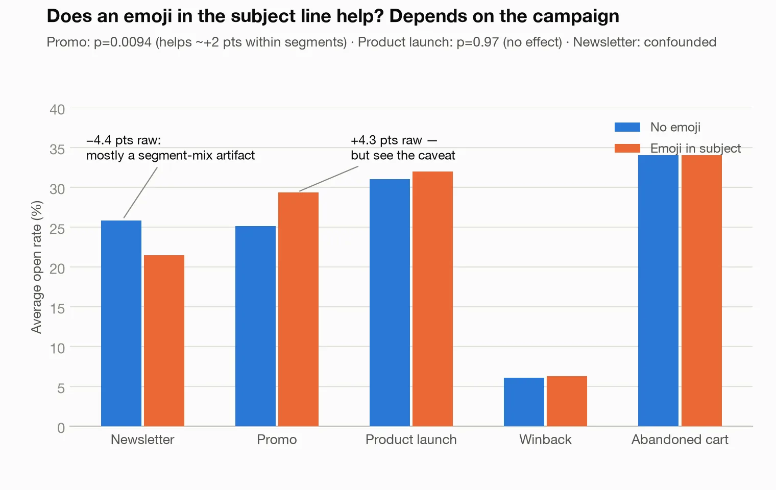
For product launches, the check came back with a clean "no effect at all," trust moderate on 34 campaigns. A no-effect answer stated plainly is worth more than a false positive dressed up as an insight.
Who actually drives email revenue?
Switching to the subscriber file: I ranked all 5,000 subscribers by lifetime revenue and split them into deciles (ten equal groups of 500).
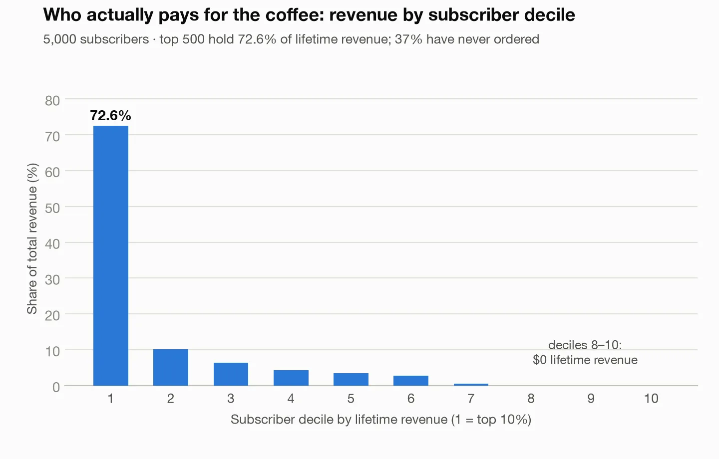
The top 500 subscribers — 10% of the list — account for 72.6% of all lifetime revenue. Deciles 8–10 have spent $0; in total, 37% of the list has never ordered. An RFM segmentation (recency/frequency/monetary — a standard way to bucket customers by how recently, how often, and how much they buy) on the 3,141 subscribers with an order history put 1,084 in the "Loyal" segment holding $406,746 of $512,054 in buyer revenue, about 79%. The tool's caveat here is worth repeating: RFM cutoffs are relative to this dataset, so the same customer can change buckets as the data grows.
Lifecycle translation: the program's revenue lives in a group small enough to email individually. Protecting those 500 people from send fatigue matters more than any subject-line trick.
I also trained a small prediction model on pre-send information only — campaign type, segment, subject length, emoji, day, hour — to rank what drives open rate. On test data it explained 96% of the open-rate variation in campaigns it had never seen, with the honest caveat that 455 rows is small enough for a model to flatter itself. The ranking of what mattered: campaign type and list segment dominate, subject length is a distant third, then weekend/hour/day, with emoji dead last. Who you email matters more than anything about how.
Why not just upload my campaign export to ChatGPT or Claude?
Pasting a 50-row CSV into a chat works fine. A real campaign export breaks down in three ways.
1. The chat re-reads your export on every question. Years of campaigns plus a subscriber file can overflow a chatbot's context; it then answers confidently from a silently truncated slice, and re-reads whatever fit on every follow-up. Here the CSVs loaded once into a local database. Claude sent queries — fifteen-plus analyzes on 455 campaigns cost one read from disk.
2. Same data, same question, same answer. Ask a chatbot to eyeball a pasted table twice and you can get two different means. Every figure here came from a real calculation with its method recorded. Results grade themselves — "moderate" trust on the 77-week fatigue analysis, two undersized-bin flags — and when the data cannot support a question, the server declines and says why. A chatbot invents a plausible number.
3. Your subscriber list stays home. The export is PII: emails, purchase histories, engagement traces. The server reads one local folder on your machine, and the model saw only group averages, never the 5,000 customer records.
What should you actually do with these findings?
For this demo program, the plain-English action list the analysis supports:
- Cap full-list sends at three per week. The fourth send bought a 2.8x unsubscribe rate for marginal reach.
- Send Tuesday–Thursday, daytime. Skip weekend evenings entirely (13.8–16.0% opens vs ~30% in the best slots).
- Write 26–39 character subject lines; never ship 80+.
- Build out abandoned-cart flows before scheduling another promo. $0.82 vs $0.053 per recipient is not a rounding error.
- Treat the top decile as an asset. 500 people carry 72.6% of revenue; segment them and lower their send pressure.
- Use emojis on promos, skip the debate elsewhere — and check any "X hurts opens" claim against segment mix first.
FAQ
What is a good email open rate? Most lists land between 20% and 40%, with 25-30% a reasonable target for a permission-based list. The number is less meaningful than it used to be: Apple Mail Privacy Protection and similar features fire the tracking pixel whether or not anyone reads the message, which inflates opens and makes them vary by mail client rather than by interest. Use opens to compare your own sends against each other, not to compare yourself against a benchmark.
What is a good email click-through rate? Around 2-5% of recipients clicking is typical for a broadcast campaign, and 10-15% of openers. Automated messages triggered by behavior — welcome sequences, abandoned cart, post-purchase — routinely beat that several times over because they arrive when the reader is already interested. Clicks are a much better health signal than opens, because a click is a real action that tracking protection does not fake.
What is a good unsubscribe rate? Under 0.5% per send is normal, and under 0.2% is healthy. A spike usually means one of three things: you sent to a list segment that never really opted in, you increased frequency faster than the list could take, or the content drifted from what people signed up for. Watch unsubscribes against send frequency over time rather than campaign by campaign, since the damage from over-mailing shows up as a trend.
What is the best day and time to send marketing emails? Mid-week mornings are the usual generic answer, but the honest one is that it depends on your audience and you should test it. B2B lists tend to respond on Tuesday to Thursday during working hours; consumer lists often do better in evenings and at weekends. Test day and daypart on your own sends over several weeks — single-campaign comparisons are too noisy to draw a conclusion from.
Do this with your own email data
The setup takes about 15 minutes: export your data as CSV and follow the instructions in the meelu-analytics-mcp README. Then ask your questions in plain English — start with the ones in this post.
Frequently asked questions
How do you calculate email click-through rate?
Divide the number of unique clicks by the number of emails delivered, then multiply by 100. If 455 people clicked out of 20,000 delivered, that is 2.3%. Use delivered rather than sent so bounces do not distort the figure. Click-to-open rate is a different metric — unique clicks divided by unique opens — and it tells you whether the message persuaded the people who actually saw it.
How do you improve email engagement?
Send less and segment more. The two changes with the largest effect are cutting frequency for people who have stopped opening, and splitting the list so each group gets mail relevant to what they bought or browsed. After that, work on the subject line and the preview text, since they decide whether the message is opened at all, and on having one clear call to action instead of five competing links. Clean inactive addresses periodically — they hurt deliverability for everyone else on the list.
What is revenue per recipient and why does it matter?
Revenue per recipient is the total revenue attributed to a campaign divided by the number of people it was delivered to. It matters because it is the one email metric that accounts for both engagement and money at once: a campaign with a modest open rate that sells well beats a campaign everyone opens and nobody buys from. Comparing revenue per recipient across campaign types is usually the fastest way to see which kinds of email are worth the send.
This post is part of building Meelu, an AI marketing agent that runs locally — site audits, data analysis, outreach, and social listening on your own machine. Join the waitlist to hear when it ships.
Related posts