How to Analyze SaaS Churn Data with ChatGPT, Claude or Any AI
I asked Claude to analyze 3,000 SaaS accounts for churn drivers — retention cohorts, an AI churn model, and a causal check on onboarding. The most useful thing it did was admit what it couldn't prove. Real numbers, real charts, and a step-by-step guide to running the same analysis on your own subscription data.
Quick answer
Export subscription data to CSV, connect an AI assistant to an analytics engine like meelu-analytics-mcp, and run retention cohorts, churn drivers and a churn model. On 3,000 demo SaaS accounts, most churn happened in the first three months, weekly login frequency was the earliest and strongest warning sign (44.1% churn under one login/week vs 1.1% at six-plus), and the causal check honestly shrank the apparent onboarding effect once confounders were adjusted for. If you just want to know which of your accounts are likely to leave next, our free churn prediction tool does that in the browser from a single CSV, no setup needed.
Every SaaS team asks the same questions of its subscription data: who is about to churn, what's the earliest warning sign, and does onboarding actually cause retention or just correlate with it? Too many of the answers floating around are a spreadsheet pivot and a hunch. So to answer them properly, I built a realistic demo dataset for a project-management SaaS — 3,000 accounts spread over 24 months of signups, with plans, seats, MRR, login frequency, onboarding status, feature adoption, support tickets, NPS, and a month-by-month activity log (30,598 rows) — and handed it to Claude connected to a local analysis engine that runs real statistics on real data.
The headline: 788 of 3,000 accounts churned, a 26.3% churn rate. But the interesting part isn't the rate. It's why — and, just as important, which "whys" the tools were willing to stand behind. Every number below comes straight out of a tool result, and every result arrived with a confidence level and a list of caveats attached. Twice, that honesty changed my conclusions.
When do SaaS customers actually churn?
First question I asked: is churn spread evenly over a customer's life, or front-loaded?
The cohort analysis grouped every account by signup month and tracked what fraction was still active N months later, across 24 monthly cohorts.
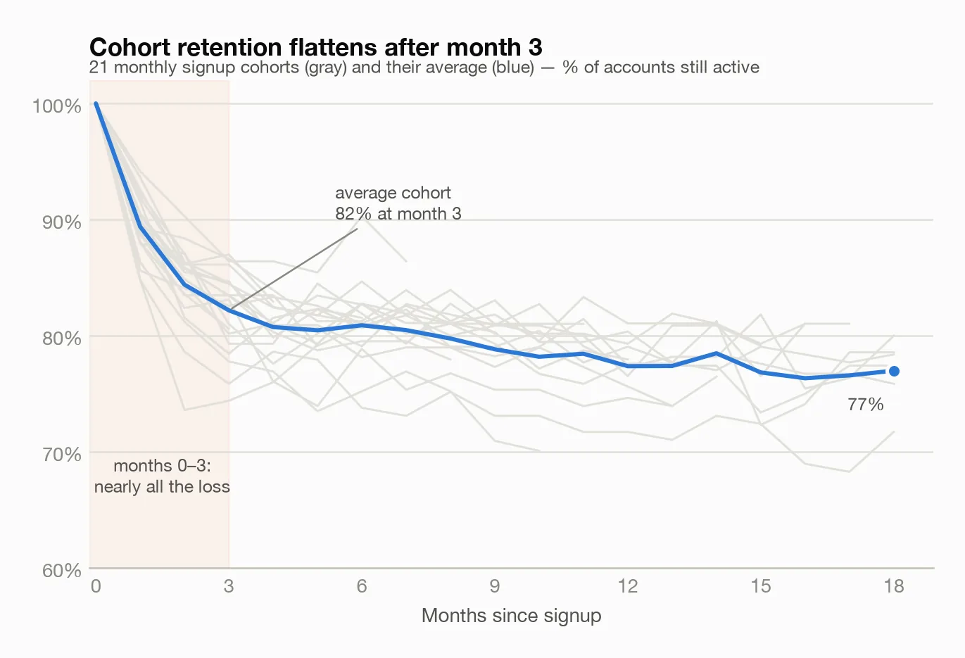
The shape is unmistakable. The average cohort keeps about 89% of accounts at month 1, 82% at month 3 — and then the curve goes nearly flat, drifting to about 77% by month 18. In other words, most of the customers we will ever lose are gone within the first three months. A customer who survives to month 4 is very likely to still be paying a year later.
That single chart reframes the whole retention problem: this isn't a "win back tired customers" situation, it's a "survive the first 90 days" situation. Onboarding, first-value time, and early engagement are where the money is.
One honest footnote the tool volunteered: small cohorts produce noisy retention percentages. With 100–150 accounts per cohort, individual monthly wiggles (the gray spaghetti) don't mean much; the average curve is the signal.
What's the earliest warning sign of churn?
I asked for the drivers of the churned flag. The tool fit a small, easy-to-inspect prediction model and reported which columns explained the outcome — and login frequency dominated, carrying 72% of the explanatory weight. The very first cutoff it chose, on its own, was average weekly logins below roughly one.
So I bucketed logins and computed churn per bucket:
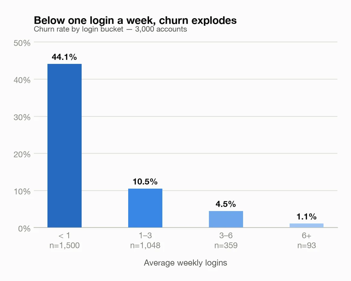
- Under 1 login/week (1,500 accounts): 44.1% churn
- 1–3 logins/week: 10.5%
- 3–6 logins/week: 4.5%
- 6+ logins/week: 1.1%
That's a 40x spread between the least and most engaged accounts. Feature adoption tells the same story from another angle: accounts using 4 or more of the product's 8 core features churn at 12.6%, versus 42.7% for accounts using 3 or fewer. And plan type matters too — annual plans churn at 7.3%, versus 35.9% for converted free trials.
If you track only one leading indicator of churn, track weekly active use. It's not subtle.
Can AI predict which customers will churn?
Yes — usefully, but not magically, and it's worth being precise about both halves.
I had the engine train a prediction model on the account table and evaluate it on test data of 750 accounts it had never seen. Results: 73.3% accuracy, separation score 0.776 (the separation score is roughly "how well the model ranks churners above non-churners," where 0.5 is a coin flip and 1.0 is perfect). In the test data, it caught 81 of 197 actual churners while flagging 84 false alarms.
That is genuinely useful for prioritizing a customer-success queue. It is not a crystal ball, and the tool said so unprompted, warning that the scores come from a single evaluation run and that "real-world performance on new data can be lower."
Then I asked what the model actually relies on, by shuffling each feature and measuring how much accuracy drops:
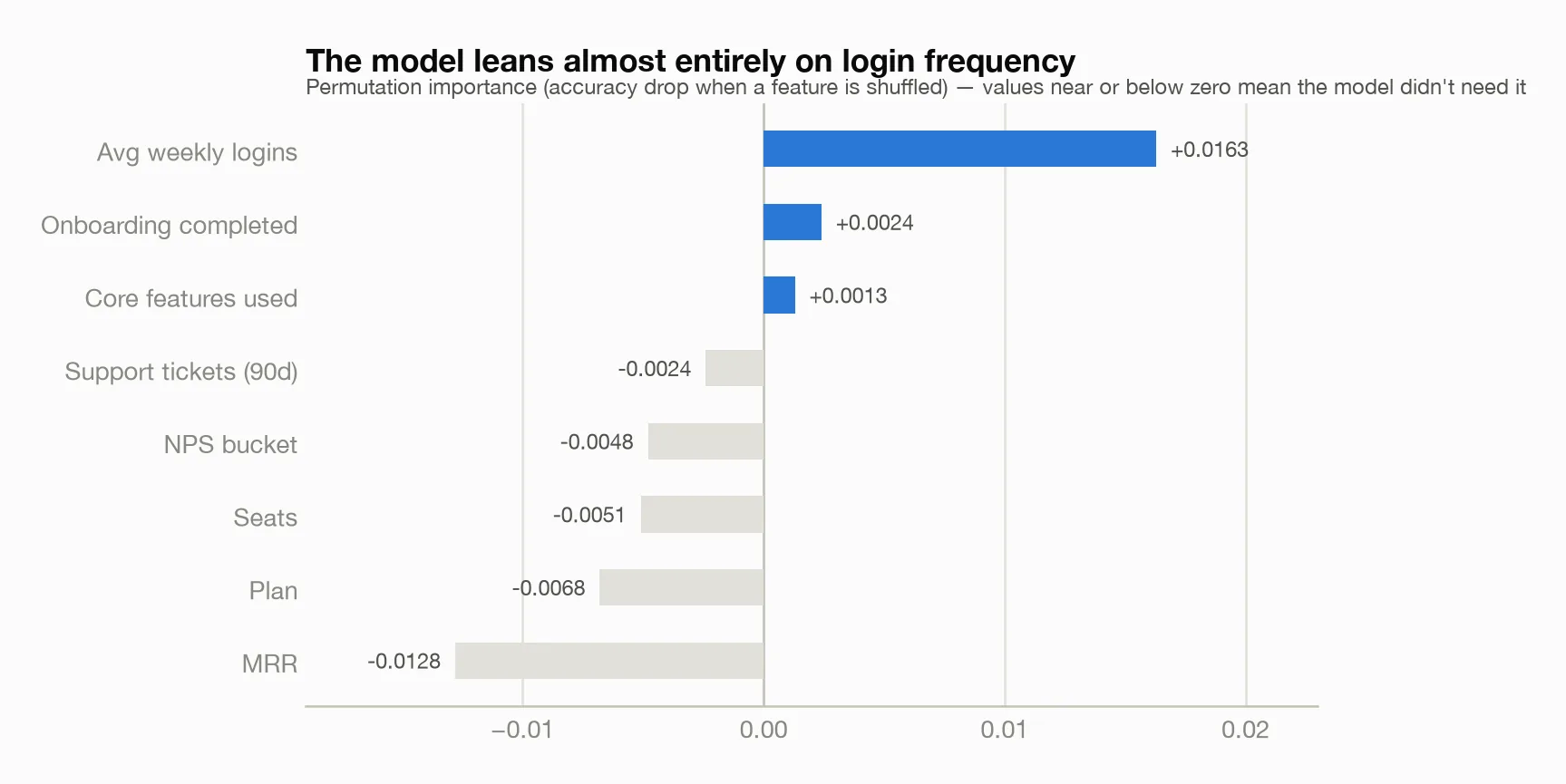
Login frequency towers over everything; onboarding and feature adoption add a little; everything else — plan, MRR, seats, NPS — contributes roughly nothing once the model already knows the engagement signals. Plan type strongly correlates with churn on its own, but it adds no new information beyond the behavior it correlates with. The tool attached exactly the right caveat here: importance shows what the model leaned on, not what causes churn.
The best part was per-account explanations in plain English. Take account acct_00104: a starter-plan account, 3 seats, $30/month, that hasn't completed onboarding, logs in 0.1 times a week, uses 2 of 8 core features, filed zero support tickets, and never answered the NPS survey. It hasn't churned yet. The model puts its churn risk around 50% — four times the ~13% baseline — and the explanation breaks the risk into named contributions: near-zero logins is the biggest push toward churn, followed by low feature adoption, the eerie silence (zero tickets), and the unfinished onboarding. That's a sentence a CSM can act on today, for an account that still has a pulse.
Does onboarding actually reduce churn — or do engaged customers just finish onboarding?
This is where most churn analyzes quietly lie to you, so I made it the centerpiece.
The naive comparison is dramatic: accounts that completed onboarding churn at 13.9%; accounts that didn't churn at 39.3%. A 25.4-point gap. The obvious conclusion — "onboarding cuts churn by 25 points, fund the onboarding team" — is the slide everyone would ship.
But there's a catch: customers who finish onboarding also tend to be the engaged ones — heavier logins, better plans, more feature use — so you can't just compare the two groups directly and credit onboarding for the whole difference. So I asked the causal-analysis tool the sharper question: holding plan, logins, feature use, tickets, seats, MRR and NPS constant, what does completing onboarding itself do to churn?
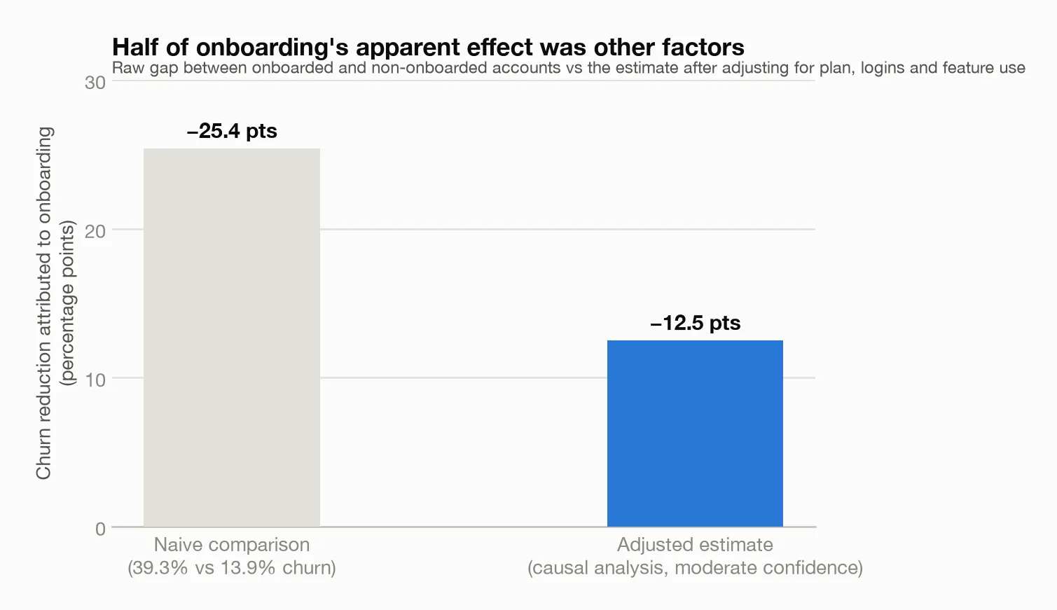
The adjusted answer: onboarding completion reduces churn probability by about 12.5 percentage points. That's half the naive gap. The other ~13 points were never onboarding's doing — they belonged to the kind of customer who completes onboarding.
And here's the part I want to dwell on, because it's the reason I trust this workflow. The tool did not hand me that 12.5 as a fact. It capped its own confidence at moderate, and spelled out why: this is observational data, not an experiment; the estimate rests on the assumption that the measured variables capture the relevant common causes; unmeasured factors could still bias it. It ran a robustness check (re-estimating after injecting a fake random cause — the effect held at -12.5) and then told me to treat the number "as a hypothesis to test, ideally with an experiment, not a proven cause."
That's exactly right, and it's the opposite of what you get from an AI that confidently narrates whatever pattern it sees. A 12.5-point effect at moderate confidence, with named assumptions, is worth ten 25-point effects delivered with a straight face. (Small confession that makes the point even better: the first time I called the causal tool, it refused outright — its causal-analysis library wasn't installed — rather than falling back to a guess. It errored, I installed the dependency, and only then did it produce a number.)
Practically: onboarding is still very much worth funding — halving early churn is a big deal — but a budget built on the naive 25-point number would promise a CFO double the achievable impact.
Why do customers who never contact support churn more?
Everyone worries about the account that files ten angry tickets. The data says worry about the silent ones.
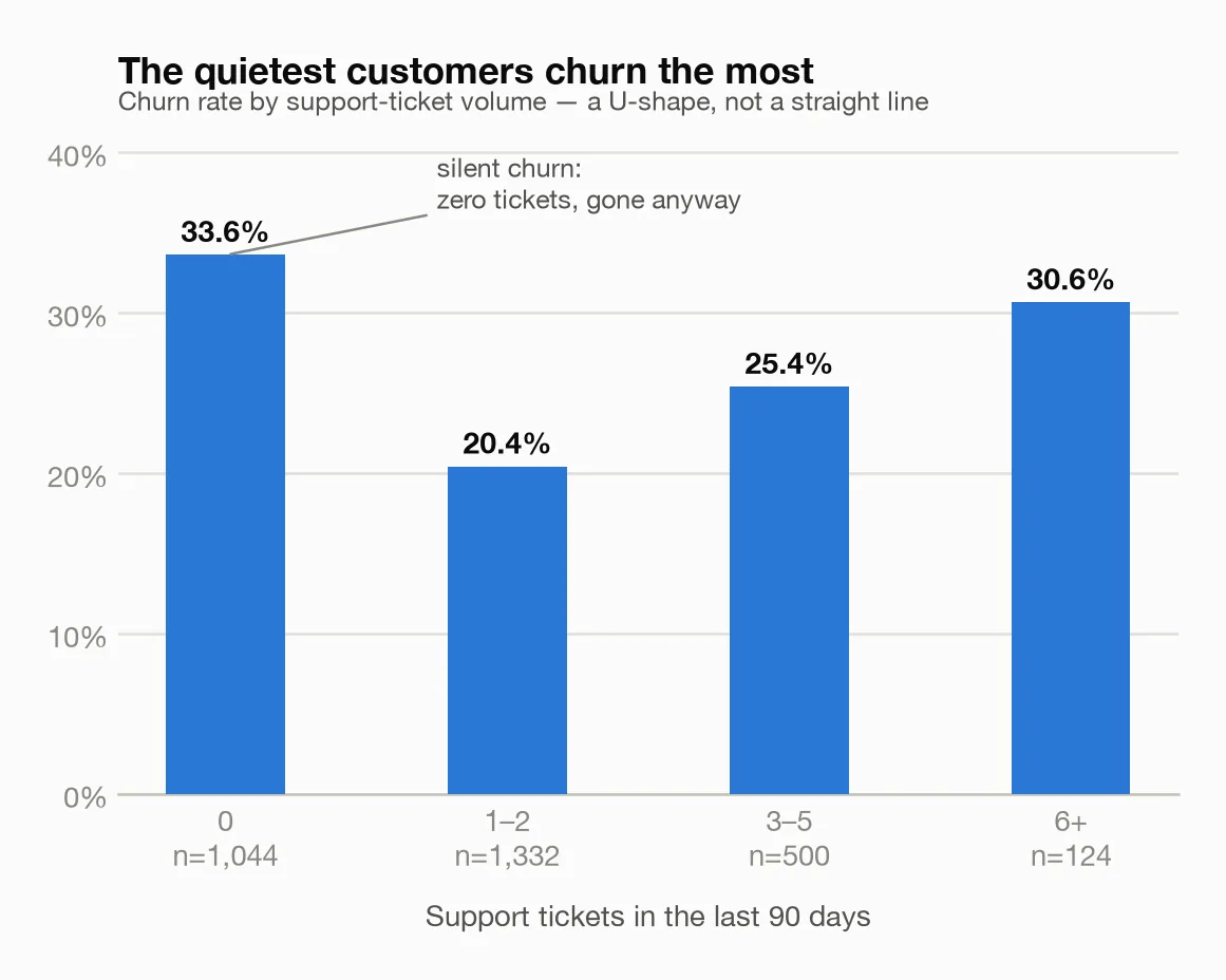
- Zero tickets in 90 days (1,044 accounts): 33.6% churn
- 1–2 tickets: 20.4%
- 3–5 tickets: 25.4%
- 6+ tickets: 30.6%
It's a U-shape, and the analysis confirms the link is real beyond any reasonable doubt, though modest in strength. A customer who opens a ticket or two is invested — they hit a wall and cared enough to ask. The customer who never writes in was often never really using the product; there was nothing to ask about. They don't complain on the way out. They just leave.
Two operational takeaways: a shrinking ticket count from a previously active account is a warning, not a win; and "no news" from a new account in its first 90 days should trigger outreach, not relief.
What customer segments should I watch?
Finally I had the engine cluster the accounts into personas. Full disclosure, delivered by the tool itself: the clusters are weakly separated — the groups blur into each other at the edges — so these are descriptive groupings — useful shorthand, not laws of nature. It flagged the result as low-confidence and I'm passing that along.
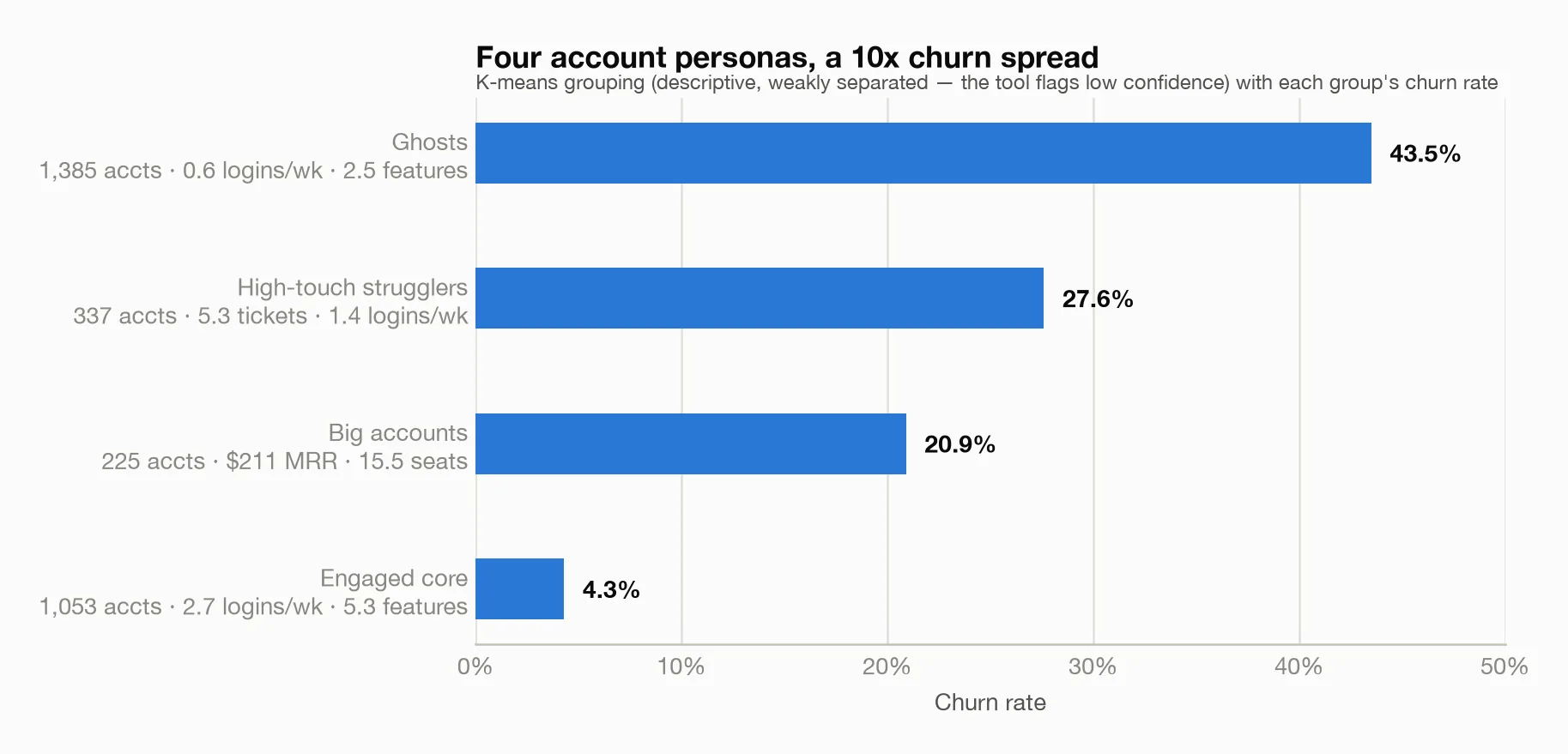
- Ghosts (1,385 accounts): 0.6 logins/week, 2.5 features, only 28% onboarded → 43.5% churn. Nearly half the base, and the silent-churn story made flesh.
- High-touch strugglers (337): moderate engagement but 5.3 tickets on average → 27.6% churn. Loud, save-able.
- Big accounts (225): $211 average MRR, 15.5 seats, but middling engagement → 20.9% churn. Small in count, painful in dollars.
- Engaged core (1,053): 2.7 logins/week, 5.3 features, 81% onboarded → 4.3% churn. The health profile everything else should be steered toward.
A 10x churn spread across personas, even from an admittedly fuzzy clustering, is enough to structure a customer-success playbook around.
Why not just upload my CSV to ChatGPT or Claude?
Pasting a spreadsheet into a chatbot is easier. Three things made the connected tool worth it here.
1. The chat re-reads your data on every question. This demo is 3,000 accounts plus 30,598 activity rows — more than a chat window holds, so the model truncates or samples, then re-reads the remnant on every follow-up. Your real billing export is bigger. Here the CSVs loaded once into a local database; the AI sent short commands ("cohort retention on activity_monthly") and got summaries back. A dozen questions moved kilobytes, never the dataset.
2. Computed answers, not narrated ones. A model reading raw rows eyeballs its aggregates; ask twice and the "churn rate" drifts. Every figure here came from code run on all 3,000 rows — same method, same data, same answer — and each result records which method it chose and why. When the data couldn't support a question, the tool refused or lowered its confidence. A chatbot always writes something.
3. Your customer list stays home. The engine runs locally; the AI saw column names, aggregates, and model summaries — never the 3,000 account records. Depending on your customers and your jurisdiction, that may not be optional.
FAQ
What is a good churn rate for SaaS? For B2B SaaS, 5-7% annual customer churn is strong and roughly 0.5-1% monthly is the usual target. SMB and self-serve products run much higher — 3-5% monthly is common and not necessarily a crisis — while enterprise contracts should be well below 1% monthly. Revenue churn matters more than customer churn, and the best companies run negative net revenue churn, where expansion from existing customers exceeds what they lose.
How do you calculate churn rate? Divide the number of customers lost during a period by the number you had at the start of it, then multiply by 100. Start with 1,000 customers, lose 30, and monthly churn is 3%. Do not count new customers acquired during the period in the denominator, or you will understate the loss. Revenue churn works the same way using recurring revenue instead of customer counts, and it gives a truer picture when your customers differ a lot in size.
What causes customer churn? Most churn traces back to a customer never reaching the point where the product became useful. The common patterns are weak onboarding, low usage of the features that deliver the core value, no active champion left at the account, and poor fit at the point of sale. Price is cited often in exit surveys but is usually a symptom: customers who get value rarely leave over cost, and customers who do not will call anything expensive.
How can you predict which customers will churn? Usage is the strongest early signal, especially login frequency and how many core features an account actually uses. Support behavior matters too, in both directions: a burst of unresolved tickets is a warning, and total silence in the first 90 days often is as well. A model fitted on your own history will rank accounts by risk, but the threshold that should trigger action is yours to find — the point is to spot decline while there is still time to respond.
Do this with your own subscription data
The setup takes about 15 minutes: export your data as CSV and follow the instructions in the meelu-analytics-mcp README. Then ask your questions in plain English — start with the ones in this post.
Frequently asked questions
What is the difference between customer churn and revenue churn?
Customer churn counts how many accounts you lost; revenue churn counts how much recurring revenue left. They can point in opposite directions — losing twenty small accounts and keeping the large ones looks bad on customer churn and fine on revenue churn. Net revenue churn also subtracts expansion from existing customers, which is why a healthy company can show negative net revenue churn while still losing customers each month.
What is cohort analysis and why use it for churn?
Cohort analysis groups customers by when they signed up and tracks each group's retention over time. It is the right tool for churn because a single blended churn number mixes brand new customers with long-tenured ones and hides whether things are getting better or worse. If each new cohort retains better than the one before it, your changes are working, even when the overall churn rate has barely moved.
How do you reduce churn?
Fix the early experience first, because most cancellations are decided in the first few weeks. That means getting new accounts to the moment the product proves useful as quickly as possible, and reaching out when usage falls rather than when the cancellation arrives. Beyond onboarding, the reliable levers are tightening who you sell to so you stop acquiring bad-fit customers, and making sure each account has more than one person who depends on the product.
This post is part of building Meelu, an AI marketing agent that runs locally — site audits, data analysis, outreach, and social listening on your own machine. Join the waitlist to hear when it ships.
Related posts