How to Analyze Shopify Store Data with ChatGPT or Claude
I connected Claude to a free, local analytics tool and let it dig through 18 months of Shopify order data. Here's how AI found my best customers, product bundles, retention leaks, and a sales forecast it honestly refused to oversell.
Quick answer
Export orders from Shopify to CSV, connect an AI assistant to a local analytics engine like meelu-analytics-mcp, and ask about customers, products and retention. On 18 months of demo order data, the analysis found the best customer segments, products that sell together as natural bundles, where retention leaks, and a sales forecast the tool refused to oversell — with a confidence level on every number. If you only want the customer segments, our free RFM analysis tool sorts your Shopify orders into best, slipping and lost customers in the browser, no setup needed.
Every Shopify order export can answer the questions store owners actually lose sleep over — who are my best customers? what sells together? will revenue grow? — but the answers are buried in thousands of rows no human wants to read. I wanted to see how far AI could get at digging them out.
Not "paste a spreadsheet into a chatbot and hope" — I connected Claude to a small analytics tool that runs locally on the computer, loaded 18 months of order data into it, and then just asked questions in plain English. The AI drove the tool; the tool did the actual math; back came answers with real numbers behind them.
One honest note before we start: the store in this post is a demo store — a fictional home & kitchen shop with data built to behave the way real Shopify stores do, so every number can be published in full. The analysis itself is completely real: every figure and chart below came straight out of actually running the tools on that data, and nothing was made up or rounded into marketing shape. The exact same workflow runs on a real export, and I'll show you how at the end.
The dataset: 3,305 orders from 900 customers between January 2025 and June 2026, totaling $252,521.56 in revenue at an average order value of $76.41. Two files: orders.csv (one row per order) and order_items.csv (7,065 line items across 25 products).
Here's what an hour of asking questions turned up.
How do I find my best customers in my Shopify data?
The first thing I asked was the question every store owner googles eventually: who actually pays my bills?
The tool scored every customer on three things — how recently they bought, how often they buy, and how much they spend — and sorted the 900 customers into named groups. (Analysts call this RFM segmentation; you can just call it "ranking customers by behavior.")
The result was blunt:
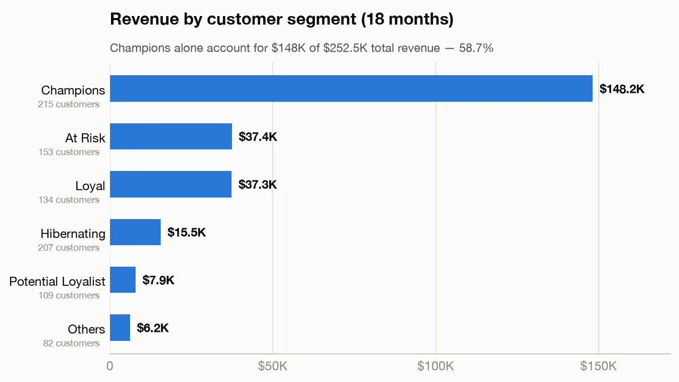
215 "Champions" — recent, frequent, high-spending customers — generated $148,166 of the $252,522 total. That's 58.7% of all revenue from 24% of customers. Meanwhile 207 "Hibernating" customers (haven't bought in ages, rarely bought much) contributed just $15,545 combined.
I pushed further and asked for the really concentrated version: what do the top 8% of customers alone look like?
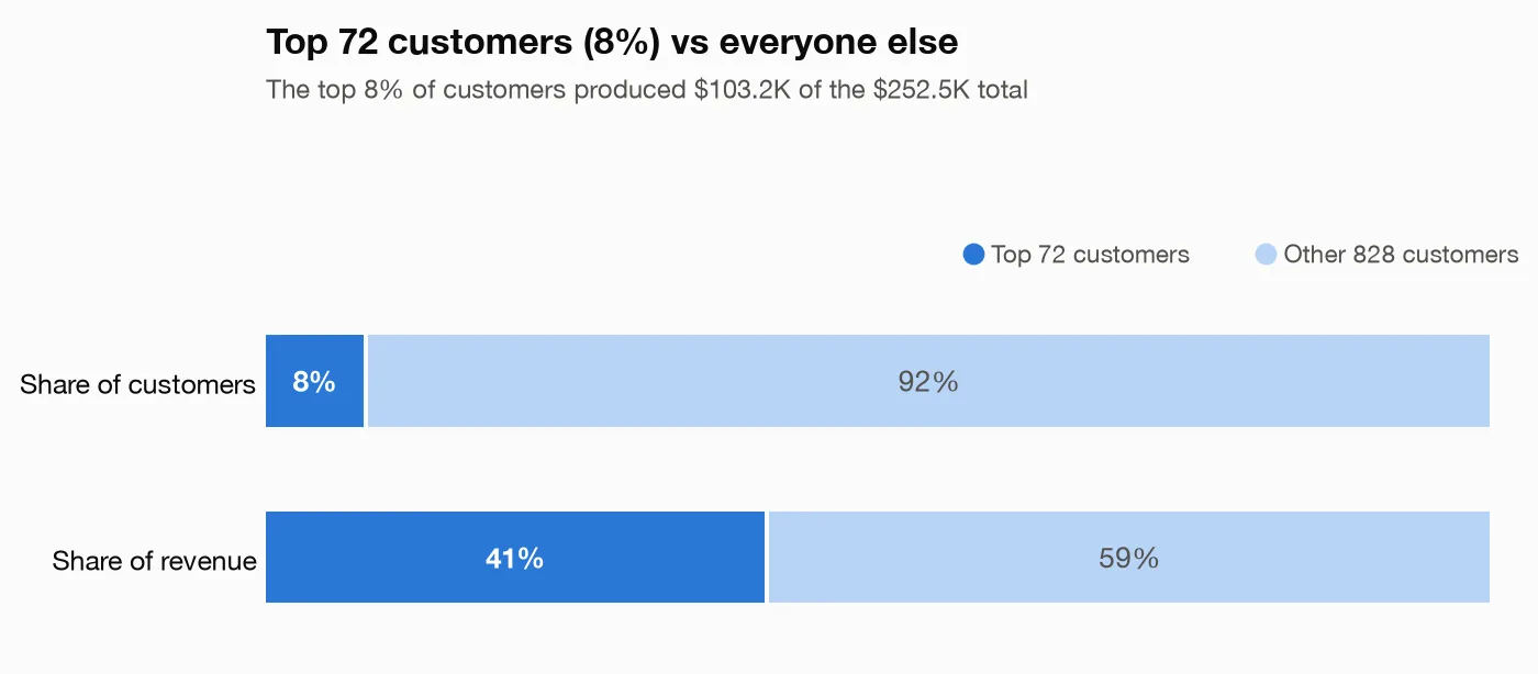
The top 72 customers — 8% of the customer base — spent $103,238, or 40.9% of total revenue. They average 12.7 orders each and $1,434 in lifetime spend, against 2.9 orders and $180 for everyone else. An email list of just those 72 people is worth more than a list of the other 828.
There's also a warning hiding in the segments: the "At Risk" group — 153 customers who used to buy often but have gone quiet — historically spent $37,422. That's the single most valuable win-back campaign this store could run, and I wouldn't have known the group existed without asking.
Which products sell together in my store?
This is the question that pays for itself fastest, because the answer becomes bundles, "frequently bought together" widgets, and post-purchase upsells.
The tool went through all 3,305 orders looking for products that appear in the same cart far more often than chance would predict. Each pairing gets a strength score — a score of 5 means the combo shows up five times more often than it would if purchases were random.
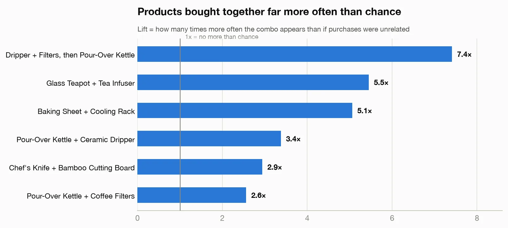
The strongest patterns, with the actual numbers:
- Ceramic Coffee Dripper + Paper Coffee Filters → Pour-Over Kettle — bought together 7.4 times more often than chance. When those two are in a cart together, the kettle is there too 70.7% of the time. This store has a pour-over coffee ritual hiding in its order data.
- Glass Teapot + Loose Leaf Tea Infuser — 5.5 times more often than chance; half of all teapot orders include the infuser.
- Baking Sheet Set + Wire Cooling Rack — 5.1 times more often than chance; 49% of baking-sheet orders add the rack.
- Chef's Knife + Bamboo Cutting Board — 2.9 times more often than chance; the cutting board rides along with 38% of knife orders.
The obvious moves: a "Pour-Over Starter Kit" bundle, and a cooling-rack suggestion on the baking sheet product page for the half of buyers who don't already add it.
One caveat the tool attached, which I appreciated: these are correlations, not causes — buying X doesn't make people buy Y, and rare combinations can look impressive by accident. It reports how often each combo actually occurs alongside every pairing, so you can check you're not building a bundle around six orders.
What is my customer retention rate — and why do buyers disappear?
Here's the chart that stung. The tool grouped customers by the month of their first purchase (a "cohort") and tracked what percentage came back in each month after:
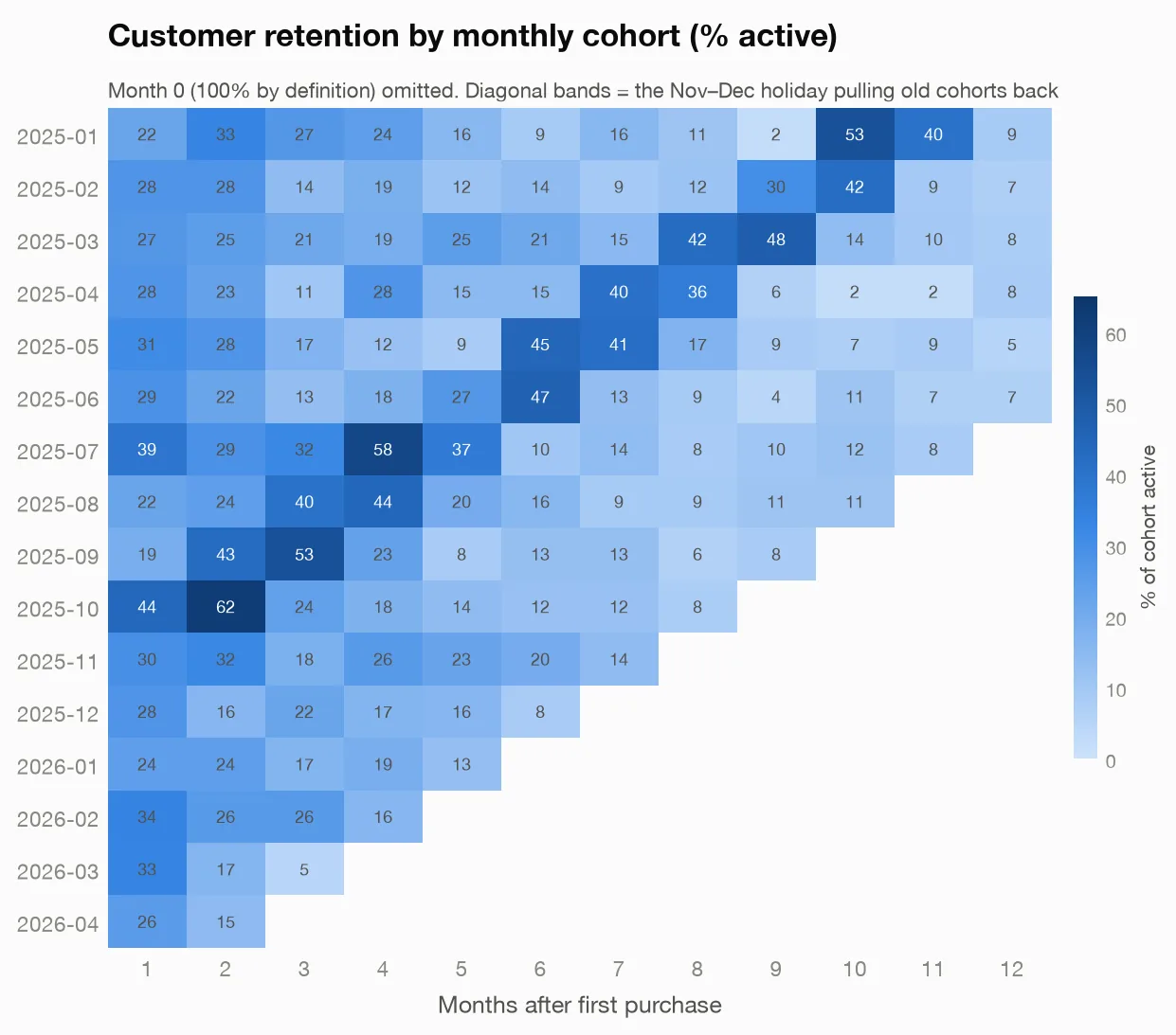
Two things jump out:
- The cliff after month one. Most cohorts keep only 20–35% of customers in the first month after their initial purchase, and it slides toward single digits from there. The steep drop is normal for ecommerce — but knowing your number is what makes a post-purchase email sequence measurable.
- The diagonal stripes are the holidays. Look at the January 2025 cohort: it decays normally, then suddenly 53% and 40% of it comes back in months 10 and 11 — which land exactly on November and December. Old customers resurrect for holiday shopping. That's a strong argument for holiday campaigns aimed at lapsed buyers, not just new-customer ads.
Then I asked a nastier question: do customers acquired with a discount stick around? The tool split customers by whether their first order had a meaningful discount (15% or more off):
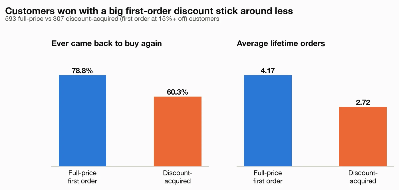
- Customers whose first order was full price: 78.8% came back, averaging 4.2 lifetime orders.
- Customers acquired with a 15–25% first-order discount: only 60.3% came back, averaging 2.7 orders.
That's 307 of the 900 customers arriving on a discount and then churning much faster. First-order discount codes buy conversions and quietly rent customers. If your ads are optimized purely on first-purchase cost, this is the number that shows the real bill.
When does my store actually make its money?
Two seasonal patterns fell out of the monthly and daily numbers:
- November and December delivered $61,976 — 24.5% of eighteen months of revenue in two months. December's $33,528 was 2.6× October's $12,842.
- Weekends run hotter than weekdays: an average of $590 in daily revenue on weekend days vs. $428 on weekdays — about 38% higher. Worth knowing when you schedule email sends and promo starts.
Can AI forecast my Shopify sales?
Yes — and this is where the setup earned my trust, because of what it wouldn't say.
I had it total revenue by month and project the next three months using a standard forecasting tool (the kind demand planners have used for decades, not a chatbot guess):
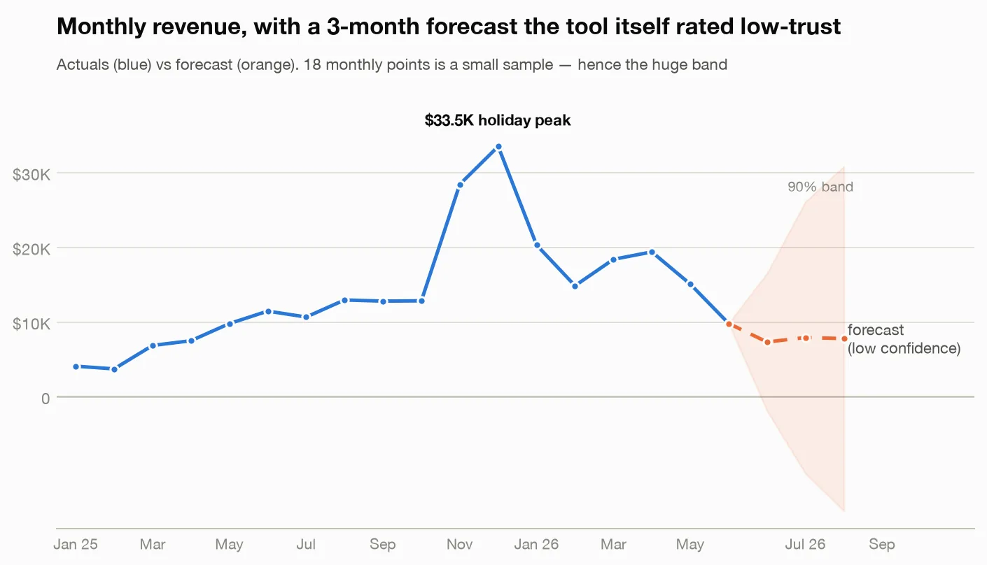
The central forecast came back at $7,322 for July, $7,924 for August, and $7,779 for September 2026. But the tool attached a "low trust" rating to it, with reasons spelled out: 18 monthly data points is a small sample; treat the result as directional. Uncertainty grows the further out you project. The forecast assumes past patterns continue. The uncertainty band around September stretched from roughly −$15,286 to +$30,843 — the tool literally showed me a band so wide it dips below zero rather than pretend it knew.
That's the honest answer. With a year and a half of history and one holiday season, no honest model can predict a specific month tightly — and I'd rather be told that than get a confident hallucinated number. (Every result in this workflow carries one of these trust ratings; the customer segments, retention, and product-pair results above all came back rated "high trust." The forecast is the one that got flagged — correctly.)
Are there weird orders hiding in my data?
Last quick win: I asked it to flag unusual orders. It flagged 72 of the 3,305 orders as unusually large (anything beyond about $201 stood out against a $63 median), of which 9 were extreme. The top seven extreme orders — ranging from $900 to $2,070 — were all placed through the marketplace channel, and they look like bulk or corporate-gift purchases (one was 40+ units of a single product).
Two lessons in one: first, there's a possible B2B/wholesale opportunity this store is serving by accident; second, those nine orders will distort any "average customer" math if you don't know they're there. The tool's own caveat was apt: outliers are flagged for investigation, not deletion — some of them are your best customers wearing a disguise.
Why not just upload my CSV into ChatGPT or Claude?
Chatbots take file uploads now. Three things still favor the connected tool.
1. The chat re-reads your data on every question. My two CSVs total 460KB — over 10,000 rows, a few hundred thousand tokens if they fit at all. A chatbot reads it all, often truncating silently, then reads it all again for each follow-up. Here the data loaded once into a local database; Claude sent short commands ("segment customers") and got back small summaries. A dozen analyzes on 3,305 orders moved less text than one raw upload, and a thirteenth question costs almost nothing.
2. Real math, the same answer every time. A model reading raw rows guesses at arithmetic — ask for retention by cohort twice and you can get two different tables, both confident. Every number here came from real calculations on the full dataset, each stamped with its method, its assumptions, and a trust rating (high/moderate/low). When the data can't support a question, the tool refuses to answer. My forecast came back "low trust, treat as directional" — exactly what you want from an analyst.
3. Your sales data never leaves your machine. The CSVs, the database, and the computation stay local. The AI sees only summaries — segment totals, retention percentages, a dozen forecast numbers — never the row-by-row customer list. If uploading your full order history to a chatbot gives you pause, this is the answer.
FAQ
What is a good conversion rate for an online store? Most ecommerce stores convert 1-3% of visitors, and above 3% is doing well. The figure varies by traffic source and device: email and returning visitors convert several times better than cold paid traffic, and desktop usually beats mobile. Because the range is so broad, the useful comparison is your own store over time or one channel against another, not your number against a published average.
How do you calculate average order value? Divide total revenue by the number of orders over the same period. $120,000 across 3,000 orders is an AOV of $40. Use order revenue consistently — decide whether you are including shipping, tax, and refunds, and then stay consistent, since mixing definitions is what makes AOV figures disagree between reports. Track it alongside order count, because a rising AOV with falling orders often means you have simply lost your cheaper customers.
How do you increase average order value? The reliable levers are bundling products people already buy together, setting a free shipping threshold slightly above your current AOV, and offering a relevant upsell or add-on at the cart rather than on the product page. Volume discounts work for consumables. What usually does not work is raising prices across the board and calling the result an AOV win, since that trades order count for revenue per order.
What is customer lifetime value and how do you work it out? Customer lifetime value is the total profit you expect from a customer over their whole relationship with you. A simple version is average order value multiplied by purchase frequency per year multiplied by the average number of years a customer stays, then multiplied by your gross margin. It matters because it tells you what you can afford to spend acquiring a customer — and because in most stores a small fraction of customers accounts for a large share of revenue, which is worth knowing before you treat everyone the same.
Do this with your own store data
The setup takes about 15 minutes: export your data as CSV and follow the instructions in the meelu-analytics-mcp README. Then ask your questions in plain English — start with the ones in this post.
Frequently asked questions
What is RFM analysis?
RFM analysis segments customers by three numbers: how recently they bought, how often they buy, and how much they spend. Each customer gets a score on all three, and the combinations describe groups worth treating differently — recent frequent big spenders are your VIPs, while people who used to buy often and have gone quiet are the ones worth winning back. It is popular because it needs only order dates and amounts, which every store already has.
How do you find which products are bought together?
Market basket analysis looks across orders and finds pairs or sets of products that appear in the same basket far more often than chance would explain. The output is usually a lift figure: a lift of 3 means those two items appear together three times as often as their individual popularity predicts. The practical use is bundling, cross-sell recommendations, and deciding what to show on the cart page.
How much order history do you need to analyze a store?
A few thousand orders and about a year of history covers most useful analysis — segmentation, product affinities, channel comparisons, repeat purchase rates. Forecasting is the exception and needs more: with only 18 monthly data points a seasonal forecast is barely more than a guess, and two or more full years makes it meaningfully tighter. Descriptive questions are forgiving; anything predicting the future is not.
This post is part of building Meelu, an AI marketing agent that runs locally — site audits, data analysis, outreach, and social listening on your own machine. Join the waitlist to hear when it ships.
Related posts